Shelter x Hemingway Design
This was a live project set by Hemingway Design and the charity Shelter. This was the first project of third year and was conducted over a six week period.
The first part of the brief was to redesign the Preston Shelter store with the intentions of then being able to role out successful design ideas to other stores. The second part of the brief was to take an element of our Preston Shelter store design and create a pop up shop based around the chosen element.
This project enabled me to gain an insight into the fast paced nature of interior design particularly within the retail sector.

Above is a concept image that I created to portray my concept idea of 'Shout About Shelter'. The concept was to create a bold and intriguing space that encourages people in the local community to learn about the work that Shelter does and why it’s necessary, through the use of striking activist art and digital art installations in the shop windows.

This visual shows the cash desk which will have a digital screen behind showing the latest updates about the work Shelter are doing in the local community and beyond.
Next to the cash desk there will be the digital catalogue area where customers can go to see the full selection of items available as there will be a limited amount on the shop floor so it can be better curated.
The back wall of the store will be an information wall using activist art work to portray why the work of the charity is so necessary.
In the foreground of the visual there is the entrance to the Advice Hub which was a requirement of the brief. I decided to use bold text around the entrance to entice people to come and seek help or to use the facilities, as it would be visible to people passing the store.
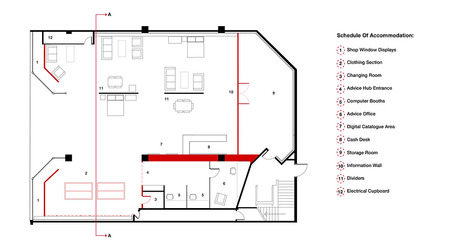
This floor plan shows how the newly inserted red wall shown in the above visual will be a major feature within the store and will help to make the store a more regular shape for a better customer experience.
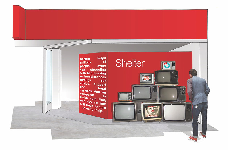
Above is a visual showing the shop window which will use retro televisions to show a digital display of activist art explaining the work that Shelter do to the passing public. Hopefully encouraging people to go and buy things in the shop, as well as encouraging more volunteers to work there and people who require their help to enter.
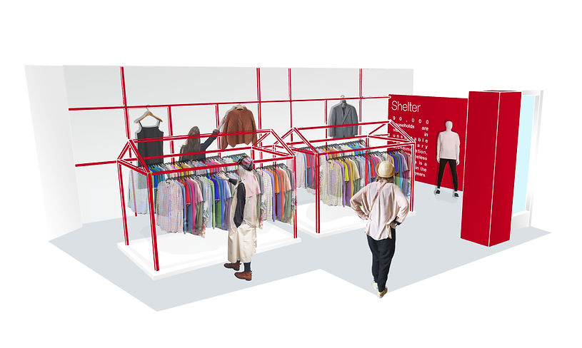
This is a visual showing the clothing section of the shop which will use red metal scaffolding to create house shaped structures to hang the clothes on. There will also be metal bars attached to the back wall which will then be used to display the best items.
Pop Up Shop
For the pop up shop I decided to carry forward the element of using activist art to inform the public about the work Shelter do and why it is so necessary that they continue to get the funding to carry on doing it.
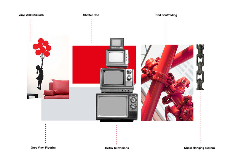
Due to the thin, long nature of the chosen location (The Hanging Ditch in Manchester) I decided to make a maze that people could walk through whilst viewing the activist art. I decided to develop the idea of the metal houses in the clothing section of the Preston Shelter store design and make the maze structure out of red scaffolding.
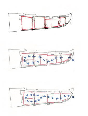

These are some initial sketches and planning ideas that I did to try and work out how the structure would fit within the space and how the activist art would fit within the structure.
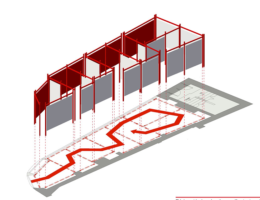
Above is an isometric showing how the red scaffolding structure would fit into the space, and where the activist art would hang from. I also decided to add a red vinyl sticker in the formation of an arrow to the floor as a way finding method so that people would know which way to make their way around the space.
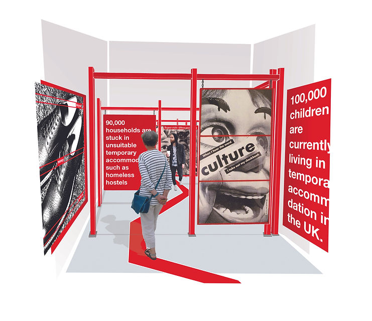
Above is a visual of someone entering into the maze structure. As people walk into the pop up shop they will be struck straight away with statistics about homelessness and the housing crisis. They will also see bold activist art which will use Shelter campaigns. These will be on red boards as you enter the shop and white boards asyou leave to help create a slightly different atmospherre within the two journeys.

This is a visual of someone leaving the pop up shop. When people get to the end of the space they will go around the turning point by following the arrow stuck on the floor. They will then be faced with positive messages about how Shelter is helping people in need and ways that they can help.